A Simple Choropleth Map with R and Leaflet
Prerequisite Math: None
Prerequisite Coding: R, Leaflet
When I worked for the Government of Canada, one of the first big projects I was assigned was co-developing an open source GIS application. A Geographic Information System is just a framework for analyzing spatial data (stuff you might see on a map), and being employed by the government meant that I had reasonably quick access to most Canadian census data. The application I’ll show you how to build today is a bit more basic, however maps remain one of the most effective tools in communicating data insights to audiences without much data experience. Everyone sees visually, and while a picture is worth 1000 words, a map can have even more impact. This post is based on a great similar post using US state data, which I encourage you to read here.
Canadian Census Regions
Before we get started on what data we’ll actually be mapping, let’s discuss boundaries (I don’t mean limitations, but rather physical borders on the map). The Government of Canada collects data according to officially defined boundaries, that vary in size/area depending usually on population. Let me be clear; we usually call such definitions census polygons, because the areas they define cover two dimensions. It is possible to collect data about roads, point coordinates, and other information, but for the purposes of our choropleth (a map that shades areas according to some value) we only want polygon boundaries. At the largest level, we aggregate data by province, but there are many other lesser known levels of granularity you might want to account for. Roughly, the order of boundary size is (from largest to smallest area):
- Province
- Census Divisions (Subsets of Each Province, often corresponding to larger counties)
- Census Subdivisions (Subsets of highly populated divisions, often corresponding to municipalities)
- Census Dissemination Areas (Some CSDs are further split), usually 400-700 people
For more rural areas, there are so few people that the lowest level of polygon is not needed - thus if we were to obtain what is called the boundary file for Canadian Subdivisions, many of the areas would simply be divisions, with further granularity only included where needed. Note that this standard of boundaries is fairly recent (10 or so years old), so older data may not be available in aggregations corresponding to these boundaries. When that happens, you may either try a larger level of aggregation, or compute such statistics yourself. At the subnational level, the government does use other boundaries in certain situations. For example:
- Census Metropolitan Areas, which are urban clusters of CSDs corresponding to 100,000 people or more
- Census Agglomerations, corresponding to CSD groups of greater than 10,000, but not CMAs
Just to give you an idea of what this defines, the Greater Golden Horseshoe Metropolitan Area (Hamilton, Niagara, and other territory in Southern Ontario), is Canada’s geographically largest CMA. Note that other countries will have different boundary definitions, like the Counties in the US (called parishes in Louisiana), or Local Authorities in the UK. Additionally, some data may be available in boundaries that are context-specific (for example polling or electoral districts). Unfortunately the choice of boundary and thus the level of granularity you can put on a map is often constrained by data availability.
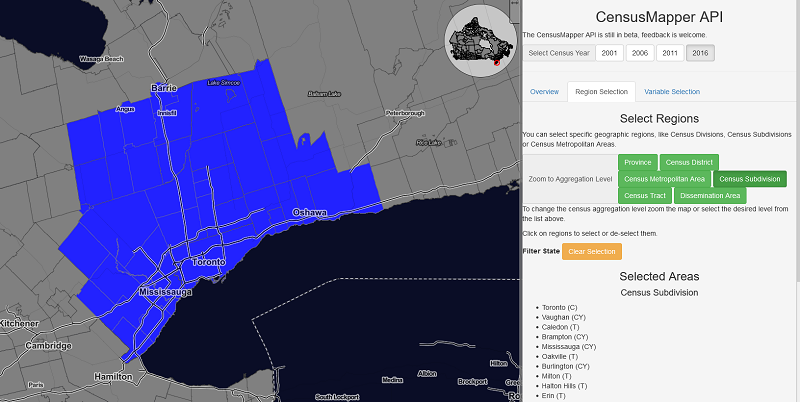
My personal favorite for Canadian Census data is the CSD (I believe it to be the Goldilocks size - not too big, not too small), which has been around long enough for there to be an abundance of associated data. Now you may be thinking it might be quite difficult to obtain a dataset containing a specific measure like income for each of these boundaries. Normally you’d be correct, but thanks to a wonderful website called CensusMapper, which you can go to here, extracting such information is not very difficult. At this point, you should visit this site, and sign up for an account if you do not have one already. Then go over to the API section, which let’s us extract the dataset we need. Under the Variable Selection tab, select the variable income (you may have to search, in which case search the word income, and select v_CA16_2213). Under the tab Region Selection , go ahead and choose Census District (another name for division, which I use here for expediency), then select all CSDs in the Greater Toronto Area. Although that definition is somewhat ambiguous, you can refer to the image below. It’s not important that your selected region looks exactly like mine, but the area you choose should be continuous.

Stretching out from the Financial district of Toronto, I go as far north as Barrie, as far east as Oshawa/Whitby, and as far West as Orangeville. After you’ve chosen those districts, you’ll need to specify Selected Regions for the Geographic Aggregation Level. Lastly, you should see the download options at the bottom of the page. Download both the variable data, and the geographic data. Once you have these two files (one should be a geojson type, and the other a csv), we can continue our work in R. I prefer RStudio, but regular old R will work fine for our purposes.
Now in R, we can start by loading in the boundary file (geos.geojson), which can be read using the geojsonio package. Make sure to install this package and load it into namespace if you have not already done so. At the same time, I will use the common tidyverse function read_csv() to import our income data.
require(tidyverse)
require(geojsonio)
districts <- geojson_read('./data/geos.geojson', what = "sp")
income <- read_csv('./data/data.csv')
names(districts)
 [1] "a"    "t"    "dw"   "hh"   "id"   "pop"  "name" "pop2" "rgid"
[10] "rpid" "ruid"
Note that R stores our boundary file as a SpatialPolygonDataFrame, which is a special data structure designed to handle a very large number of reference points (usually latitude and longitude). It essentially operates as a nested list, with 36 individual districts/divisions each containing their own information. We can see that the dataframe itself has an attribute called data, which contains several other pieces of information, including household number and id, as well as population (in 2 different forms). Essentially what we’re trying to do is add our income data as another variable in this set. Once we do that, creating the map is fairly straightforward.
Before we do this, let’s take a look at our income data. I’m going to start by renaming the default label to median income. Then I’ll take a look at the distribution of income in our area.
income <- income %>% rename(med_income = `v_CA16_2213: Median after-tax income in 2015 among recipients ($)`)

income %>% ggplot() + geom_histogram(aes(x = med_income),
                                     binwidth = 500, fill = 'red') +
  ggtitle('Histogram of Median After-tax Income in the GTA') +
  labs(x = 'Median Income') + theme_classic()
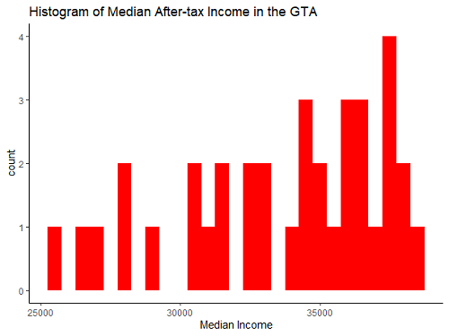
This code generates the following plot:

We get some fairly standard results here - most of the weight of our distribution is near the middle, with a small number of districts on the lower end, and a larger number on the higher end. Why are we looking at this? Well, when making choropleth maps, where a continuous variable will be split into bins, how exactly we choose our split points will greatly change the map. There is no optimal way of choosing your splits based on the final product, but it is common to either A) split by quantile, so each color contains the same number of districts, or B) split evenly along the x-axis of the distribution, so each color contains the same amount of income. In this case, what I’ll do is option B - this will present the data as truthfully as possible. But before we worry about splitting the data, we need to combine our datasets.
Depending on the datatype, this part may be quite difficult, as it can involve careful identification of exact locations within a complex index scheme for a large data structure, but here it’s quite simple. I’ll just add our renamed variable above to the districts dataset. It’s important to confirm (either by hand, or with a test) that the length of the recipient data is identical to that of our income column. I already know it is here (in this case each has 36 districts), but in general you may be dealing with missing data, which would need to be dealt with before the map can be created. You should also make sure that the ordering of both sets is equal, otherwise you might be pairing the income of Whitby with the boundaries corresponding to Ajax (or similar errors). Sorting by both sets by id before combining data can solve this problem. In this case, the data already comes sorted, so no issues there.
districts$med_inc <- income$med_income
names(districts)
[1] "a"       "t"       "dw"      "hh"      "id"      "pop"
[7] "name"    "pop2"    "rgid"    "rpid"    "ruid"    "med_inc"
Awesome! All we have left is to create the map with leaflet. One of the benefits of MapBox is that it will provide much of the finer details you might expect on a map. This includes things like coastlines, roads, waterways, and landmarks. All we have to do is add our district boundaries and the data associated with them. Now because MapBox maintains geographic information for the whole world, we have to tell our map ‘where to look’, so to speak, which can be accomplished by obtaining the latitude and longitude point for the town of Vaughan (which will be the center of our map). How did I know to choose Vaughan? In this case, I eyeballed it. I grew up in the GTA, so I had a good idea of where to look. As you’ll see in the code below, the center of the map is a parameter that you may have to experiement with to get the position just right. Google Maps is your friend here; simply search Vaughan, and extract the lat and long from the url in your browser. In the code below, your lat and long obtained earlier.
require(leaflet)
m <- leaflet(districts) %>%
  addTiles()  %>%
  setView( lat=43.8369994, lng=,-79.7060246 , zoom=8)
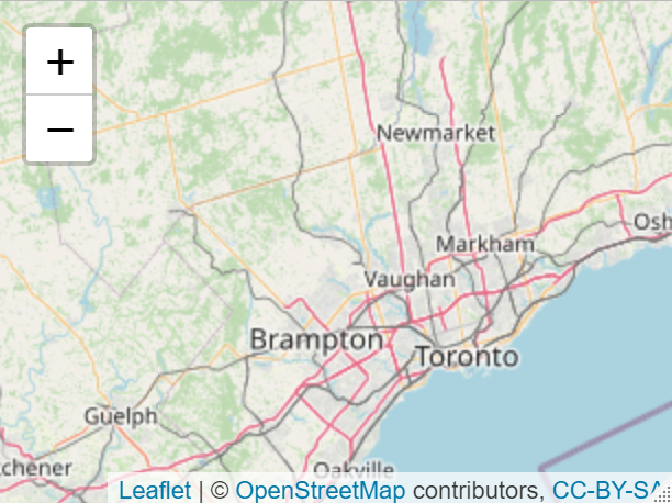
Note the third parameter in our setView() function, which controls the level of zoom. This is just an integer that mandates how granular our map is (a map of the would should zoom further out, but for our GTA scope, we want to be zoomed in quite a bit). The code above instantiates the leaflet map object along with the base layers provided by default in MapBox (Mapbox is the owner of leaflet). Here is the basic information leaflet provides:

The above is just a static picture of the widget we will eventually build, but you can see how convenient it is that so much information is already provided for you. It’s not obvious from the static image above, but Leaflet provides such information for every country (we just happened to be interested in Canada). So now all that remains is to add our custom information on top of what is given. This is also fairly straightforward. We simply add to our existing code a layer of polygons defined by our dataset. To do this, though, we must define the color bins we want to use for our choropleth, which I do first:
bins <- c(25000, 27500, 30000, 32500, 35000, 37500, 40000, Inf)
pal <- colorBin("YlOrRd", domain = districts$med_inc, bins = bins)
m <- m %>% addPolygons(
  fillColor = ~pal(med_inc),
  weight = 2,
  opacity = 1,
  color = "white",
  dashArray = "3",
  fillOpacity = 0.7)
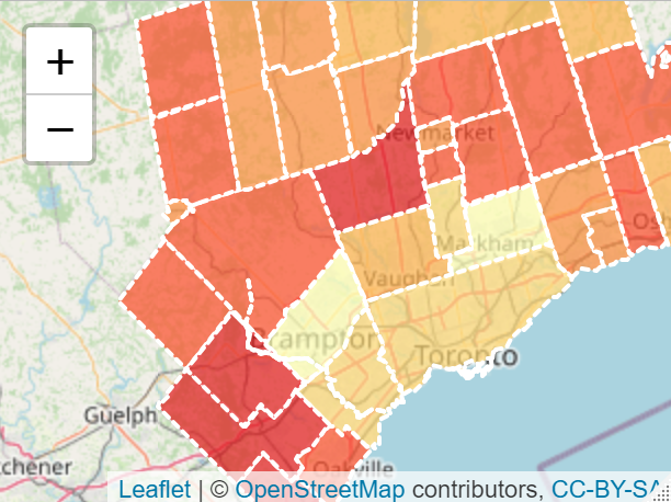
The above code gives us the following map:

Not bad, right? But in the current form, it can be difficult to tell exactly which color means what, and which district you’re actually looking at. So we can add a simple interactive pop up that displays the district name, and the exact median income whenever a user hovers over that district. Again, this is pretty simple, and we’ll use some custom html labels to present the information in a visually pleasing way. This involves modifying our existing code slightly:
# Add Labels
labels <- sprintf(
  "<strong>%s</strong><br/>$ %g",
  districts$name, districts$med_inc
) %>% lapply(htmltools::HTML)

m <- m %>% addPolygons(
  fillColor = ~pal(med_inc),
  weight = 2,
  opacity = 1,
  color = "white",
  dashArray = "3",
  fillOpacity = 0.7)#,
  highlight = highlightOptions(
    weight = 5,
    color = "#666",
    dashArray = "",
    fillOpacity = 0.7,
    bringToFront = FALSE),
  label = labels,
  labelOptions = labelOptions(
    style = list("font-weight" = "normal", padding = "3px 8px"),
    textsize = "15px",
    direction = "auto"))
I won’t show you exactly how this looks yet, but you’ll see the finished version at the end of the post. A couple of parameters in the above code are quite important: Opacity indicates how transparent the polygons will be - I set the transparency to be low, but that’s a matter of preference, and depends on how much information from the base layers you might want users to see. Also note the bringToFront parameter, which will place our information at the top of the stack if set to TRUE.
The last thing I will do (which is good practice for any map) is to add a legend. This can be chained onto our existing code as well, and I use the color bins we defined earlier:
m <- m %>% addPolygons(
  fillColor = ~pal(med_inc),
  weight = 2,
  opacity = 1,
  color = "white",
  dashArray = "3",
  fillOpacity = 0.7,
  highlight = highlightOptions(
    weight = 5,
    color = "#666",
    dashArray = "",
    fillOpacity = 0.7,
    bringToFront = TRUE),
  label = labels,
  labelOptions = labelOptions(
    style = list("font-weight" = "normal", padding = "3px 8px"),
    textsize = "15px",
    direction = "auto")) %>%
  addLegend(pal = pal, values = districts$med_inc, opacity = 0.7, title = "Median Income in Toronto",
             position = "bottomright")
And we’re done! Fairly short in terms of code, we now have an interactive map that anyone can look at if they have the html file. One thing you’ll see in the complete code below is that I use the HTMLtools package in R to save the widget as a stand-alone file, that can easily be opened in your browser. Below is the complete code, along with the resulting widget:
#### Simple Choropleth of Income ####
require(tidyverse)
require(geojsonio)
districts <- geojson_read('./data/map.geojson')
income <- read_csv('./data/data.csv')

names(districts)

income <- income %>% rename(med_income = `v_CA16_2213: Median after-tax income in 2015 among recipients ($)`)

income %>% ggplot() + geom_histogram(aes(x = med_income),
                                     binwidth = 500, fill = 'red') +
  ggtitle('Histogram of Median After-tax Income in the GTA') +
  labs(x = 'Median Income') + theme_classic()

districts$med_inc <- income$med_income
names(districts)

m <- leaflet(districts) %>%
  addTiles()  %>%
  setView( lat=43.8369994, lng=,-79.7060246 , zoom=8)

bins <- c(25000, 27500, 30000, 32500, 35000, 37500, 40000, Inf)
pal <- colorBin("YlOrRd", domain = districts$med_inc, bins = bins)


# Add Labels
labels <- sprintf(
  "<strong>%s</strong><br/>$ %g",
  districts$name, districts$med_inc
) %>% lapply(htmltools::HTML)

m <- m %>% addPolygons(
  fillColor = ~pal(med_inc),
  weight = 2,
  opacity = 1,
  color = "white",
  dashArray = "3",
  fillOpacity = 0.7,
  highlight = highlightOptions(
    weight = 5,
    color = "#666",
    dashArray = "",
    fillOpacity = 0.7,
    bringToFront = TRUE),
  label = labels,
  labelOptions = labelOptions(
    style = list("font-weight" = "normal", padding = "3px 8px"),
    textsize = "15px",
    direction = "auto")) %>%
  addLegend(pal = pal, values = districts$med_inc, opacity = 0.7, title = NULL,
             position = "bottomright")


library(htmlwidgets)
saveWidget(m, file=paste0( getwd(), "/data/income-choropleth.html"), selfcontained = True)
That’s it! Now you have an incredibly intuitive map that anyone can interact with.