Some Common Clustering Algorithms
Prerequisite Math: Calculus (Derivatives), Intermediate Statistics (Prior, Likelihood, Posterior)
Prerequisite Coding: Python (Sci-kit Learn)
Sometimes, when building a ML model, we don’t want have a target value or class we want to predict. Instead, we just want to identify some possible structure in the data. When would you want to do this? An obvious example would be for customer segmentation, if a company wants to identify groups of similar customers. Another example would be the grouping of purchases to identify fraudulent charges. This are just a couple of examples, but the general idea is to look for patterns in a set of unlabelled (or unsupervised) data. We call this type of learning clustering because the structure we are looking for groups the data into clusters. There are many different types of clustering algorithms, but today I’m going to introduce you to the three most popular:
- K-Means Clustering
- Hierarchical Clustering
- DBSCAN
We’ll look at how each is implemented, then we’ll run each algorithm on the same dataset. Finally, we’ll walk through the tradeoffs associated with each type of algorithm. Though I will go into depth on how each algorithm works, the code itself will be highly abstracted, coming from python’s scikit-learn ML API.
Today’s Dataset
To demonstrate each of the above algorithms, I’ll use the Old Faithful dataset, which contains data on the eruptions from the Old Faithful Geyser in Yellowstone National Park. This dataset has no labels (as you might expect), and has just two features: duration of eruption, and waiting time between current and next eruption. This data has been used in a Kaggle competition, and thus is already available fully cleaned. You can download it as a csv file here.
I’ll start by loading in the data, then I print a few observations so you can see what we’re working with.
# Load in the data
import numpy as np
import matplotlib.pyplot as plt
import pandas as pd
from sklearn.cluster import KMeans
import io

% matplotlib inline

from google.colab import files
uploaded = files.upload()

df = pd.read_csv(io.StringIO(uploaded['faithful.csv'].decode('latin-1')))
print(df.head(5))

#---------------------------------------------------------------------------

   Unnamed: 0  eruptions  waiting
0           1      3.600       79
1           2      1.800       54
2           3      3.333       74
3           4      2.283       62
4           5      4.533       85
It’s always a good idea to plot your features, so you can get a sense of how the data look, and whether clustering is appropriate.
X = np.array(df[['eruptions', 'waiting']])
plt.scatter(X[:, 0], X[:, 1], marker='.')
plt.xlabel('Eruption Duration')
plt.ylabel('Waiting Time Between Eruptions')
plt.show()
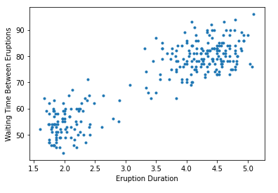
We can see that the data separates somewhat cleanly into at least two groups, which makes it ideal for clustering algorithms. Let’s discuss exactly what this means, and why it matters.
Clustering
I’ve talked about clustering in previous posts, but I’ll review it again here. Recall that in Machine Learning, clusters are just groups of unlabelled data points that share feature similarity. These collections of points are close together in feature space. The goal of clustering algorithms then, is to take an arbitrary set of points and identify these hidden groups. Unlike in the supervised learning setting, where our dataset has labels with which to evaluate the performance of our algorithm using some kind of loss, clustering is almost always unsupervised, so it can be difficult to find a correct answer. However most examples rely on domain knowledge to inform what constitutes a reasonable clustering assignment. Visualization can also be extremely helpful - you should be able to see the different groups clearly.
There are many different examples of clustering, but here are some common applications:
- Grouping customers by purchasing patterns
- Deciding optimal placement of city parks by identifying clusters of foot traffic
- Optimizing Neck Size and Arm Length of shirt sizes
In all of these cases, and in virtually all clustering algorithms, the points are represented by vectors, with features as entries. The algorithm’s job is to assign each point to a specific cluster. A warning before we get started - always remember to scale your features when using distance-based algorithms, so as to avoid one feature dominating the others. Scikit-learn transformers will often do this for you, but it never hurts to double check.
K-Means
The K-Means algorithm is an iterative process that splits the dataset into K non-overlapping subsets without any cluster-internal structure. Each group has an associated center of mass (centroid), and it is the distance from these centroids that determines whether a point belongs to a given cluster. The goal of this algorithm in particular is two-fold: to determine the optimal assignment of points for a given collection of clusters, and to determine the optimal placement of cluster centres given the collection of points. This brings up a curious chicken egg problem - if we knew the true cluster assignments, we could easily compute the cluster centres; But if we knew the true cluster centres, finding the optimal assignment would be just as easy. So how do we deal with this problem? We use the following iterative approach:
- Randomly initialize K cluster centres in feature space (K is a hyperparameter - more on this later).
- Compute the distances between each point and each cluster center.
- Assign each point the cluster label corresponding to the closest cluster center.
- Holding constant the cluster assignments, recompute the centroids of each cluster.
- Repeat steps 2-4 until convergence (ie until cluster centroids and/or cluster assignments no longer change).
Sounds impossibly simple right? Well most great ML algorithms are. This one has its strengths and weaknesses too. One good consequence is that, under this approach, the within-cluster variance is minimized while the between-cluster variance is maximized. Like points share a group, and unlike points do not. A more subtle result involves the shape of the clusters. Since we use distance from a centroid as our guide to find optimal assignment, the clusters of K-Means are perfect circles (or hyperspheres in higher dimensions). Depending on the application, this may not be desirable. I should also mention that K-Means is not guaranteed to converge to a global optimum; you will get a locally optimal set of clusters, but it is not necessarily going to give the best result. However, there are some ways to prevent this. You can (and should):
- Run the algorithm multiple times with different initializations
- Randomly break and combine clusters between iterations
Recall that I mentioned we typically do not have labels. Though this is true, we can still use a cost function which will tell us which assignments are better than others. Typically we use the average distance between a point and its cluster centroid. Notice that, the more clusters we choose to identify (the higher K we pick), the smaller that average distance will be. Note also that as the algorithm iterates, this cost will decrease. In the extreme, if \( K = N \), we end up with a cost of zero, since each data point represents its own cluster (and cluster centroid). One corollary of this is that we can run the algorithm for a number of different values of \( K \), and plot cost against \( K \). This is called a scree plot, and the natural choice of K would present itself as an elbow, or a kink in this plot.
Now let’s actually run this algorithm with our dataset. scikit-learn has a very convenient transformer that will allow us to generate clusters very quickly. In the following code, I run a typical scikit-learn workflow: I instatiate our model object, passing as arguments the necessary hyperparameters. Then I fit the data to our model, which in this case generates our cluster assignments. Lastly, I extract the resulting cluster labels and cluster centroids. Recall our plot above. To begin, let’s try finding only 2 clusters (\( K=2 \)).
## Fit KMeans
k_means = KMeans(init = "k-means++", n_clusters = 2, n_init = 12)
k_means.fit(X)

k_means_labels = k_means.labels_
k_means_cluster_centers = k_means.cluster_centers_
print(k_means.cluster_centers_)
#-------------------------------------
[[ 4.29793023 80.28488372]
 [ 2.09433    54.75      ]]
Voila! Just 2 lines of code to fit the model, and a few more to extract the relevent estimates. Before we inspect the results, take note of the two additional hyperparameters in the call to instantiate k_means. k-means++ is a special initialization algorithm used with K-Means clustering to speed up convergence. Don’t worry about how it works exactly, just know that it’s saving you time. The other hyperparameter is called n_init, and it simply controls the number of initializations we run. If you remember earlier, this is how we avoid getting stuck in a local optimum. Scikit-learn takes the best of our 12 runs and returns that. We can see that the resulting cluster centers take the form of a numpy array whose columns represent coordinate values in our feature space. But how well do these clusters actually reflect our data? Just like before, we can create a plot to find out. To show you the difference, I also plot the assignments when we use 4 clusters instead of 2.
#Initialize the plot with the specified dimensions.
fig = plt.figure(figsize=(6, 4))
# Colors uses a color map, which will produce an array of colors based on
# the number of labels there are. We use set(k_means_labels) to get the
# unique labels.
colors = plt.cm.Spectral(np.linspace(0, 1, len(set(k_means_labels))))
# Create a plot
ax = fig.add_subplot(1, 1, 1)
# For loop that plots the data points and centroids.
# k will range from 0-3, which will match the possible clusters that each
# data point is in.
for k, col in zip(range(len([[4,4], [-2, -1], [2, -3], [1, 1]])), colors):
    # Create a list of all data points, where the data poitns that are
    # in the cluster (ex. cluster 0) are labeled as true, else they are
    # labeled as false.
    my_members = (k_means_labels == k)
    # Define the centroid, or cluster center.
    cluster_center = k_means_cluster_centers[k]
    # Plots the datapoints with color col.
    ax.plot(X[my_members, 0], X[my_members, 1], 'w', markerfacecolor=col, marker='.')
    # Plots the centroids with specified color, but with a darker outline
    ax.plot(cluster_center[0], cluster_center[1], 'o', markerfacecolor=col,  markeredgecolor='k', markersize=6)
# Title and axesof the plot
ax.set_title('KMeans (K=4)')
plt.xlabel('Eruption Duration (Seconds)')
plt.ylabel('Waiting Time Between Eruptions')
# Show the plot
plt.show()
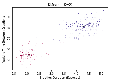
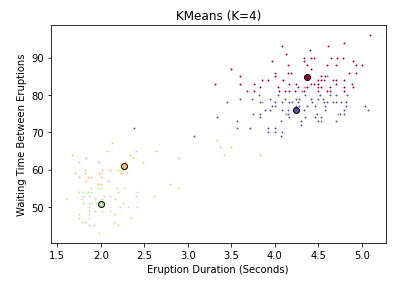
You can clearly see that 2 clusters seems a more natural fit than 4. But be careful when using a subset features in a high-dimensional dataset - what looks like a bad fit when projected down to 2 or three dimensions might actually be appropriate with a different subset of features. Now you might ask, is there a more empirical way of determining the best value of K? Yes there is. We can use the scree plot I mentioned above. And thanks to scikit-learn, this is less painful than you might expect. The fit_transform() method will transform our data into the point-cluster distances we’re after. All I have to do is convert the square distances (as is convention in scikit-learn) into ordinary Euclidean distance, and compute the mean. Let’s try fitting the model to several values of K, and seeing which one give the best average distance between points and their cluster centroids.
# Store the mean distances
mean_dists = []
# Number of observations
N = X.shape[0]
# Values of K we want to try
K = np.arange(1,10)

for k in K:
  k_means = KMeans(init = "k-means++", n_clusters = k, n_init = 12)
  # Extract point-cluster squared distances
  d_point_clusters = k_means.fit_transform(X)
  # Add the mean of the root of the distances to our list
  mean_dists.append(np.mean(np.sqrt(d_point_clusters)))

## Plot our results
mean_dists = np.array(mean_dists)

plt.plot(K, mean_dists)
plt.xlabel('Number of Clusters (K)')
plt.ylabel('Mean Point-Cluster Distance')
plt.show()
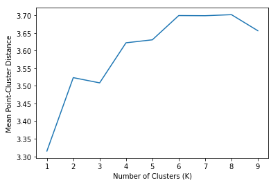
Keep in mind that the distance on the Y-axis is something we want to minimize, however simply using 1 cluster doesn’t really give us much useful information. We can see a clear kink or elbow at \( K=3 \), which indicates that a choice of three clusters is appropriate. This matches what we see visually, and also matches intuition. The Geyser appears to have roughly three kinds of eruptions. Those that do not last very long (low duration), but occur in frequent succession (low waiting time), and those that last longer, but occur more infrequently. Lastly, we have those that sit in the middle.
Hierarchical Clustering
Hierarchical clustering is a newer, and very different approach. Unlike in K-Means where clusters were non-overlapping, the goal of hierarchical clustering is to generate a series of clusters that have a hierarchical (tree-like) relationship. In this tree, each node is a cluster that consist of the clusters of its daughter nodes. Essentially what this algorithm does is start from raw data points, and build a tree of hierarchical clustering assignments. There are two main ways to build such a tree:
- From the top down (called Divisive, because we start with one cluster, and split it up)
- From the bottom up (called Agglomerative, because we start with several clusters, and combine them)
Both work well, but agglomerative has been more popular in recent years. Once the entire tree is built, we can visualize the assignments in a special graph called a dendrogram. To get disjoint clusters, we just cut the dendrogram horizontally (like cutting a tree by the trunk). We’ll see one shortly, but first let’s formalize the hierarchical clustering algorithm. It follows the following steps:
- Create \( N \) clusters, one for each data point.
- Compute the proximity matrix, which measures the distances between each cluster and every other cluster
-
Repeat until \( K = 1\):
i) Merge the two closest clusters
ii) Update the proximity matrix, storing the old version
- Return all cluster assignments
Like K-Means, the above algorithm is surprisingly simple. But there are a couple of questions that come to mind. What distance metric should be used? Also, two clusters have multiple points, how do we measure the distance between them? The first question does not have a best answer. Depending on the application, you may find different metrics do better. Some examples include euclidean distance, manhattan distance, and cosine similarity (I encourage you to read my post on K-Nearest Neighbors to see more information on such metrics). However the second question has garnered a number of different approaches, and it too does not have one best answer. There are several ways of computing distances between multipoint clusters, such as:
- Single Linkage Clustering: Uses the minimum point-to-point distance between clusters.
- Complete Linkage Clustering: Uses the maximum point-to-point distance between clusters.
- Average Linkage Clustering: Uses the average point-to-point distance between clusters.
- Centroid Linkage Clustering: Uses the distance between cluster centroids.
Whatever the choice of linkage, notice that the construction of clusters will always be entirely dependent on the dataset. Unlike with KMeans, that may return different clusters with different random initializations, the Hierarchical Clustering algorithm will always return the same clusters. Moreover, there is no hyperparameter choice, like the K we had before. Is this a good thing? It depends on the data and the application. One clear advantage to hierarchical clustering is that it gives many possible clustering assignments to the user after only one execution. Just be careful - in large datasets, training can be very slow because of the proximity computation in each iteration.
So does this algorithm work better for the Old Faithful dataset specifically? We can find out rather quickly. Scikit-learn has an easy method for fitting Agglomerative Clustering, and the scipy package has some very helpful plotting functions. In the code below, I will use average linkage, but you could easily change this. I’ll first plot the resulting assignment for 2 clusters, then create a dendrogram using all possible assignments.
from sklearn import manifold, datasets
from sklearn.cluster import AgglomerativeClustering
from scipy import ndimage
from scipy.cluster import hierarchy
from scipy.spatial import distance_matrix

agglom = AgglomerativeClustering(n_clusters = 2, linkage = 'average')
agglom.fit(X)

## Plot with 2 clusters

#Initialize the plot with the specified dimensions.
fig = plt.figure(figsize=(6, 4))

colors = plt.cm.Spectral(np.linspace(0, 1, len(set(agglom_labels))))
# Create a plot
ax = fig.add_subplot(1, 1, 1)
# Plots the datapoints with color col.
ax.scatter(X[:,0], X[:,1], c=agglom_labels)

# Title and axesof the plot
ax.set_title('Agglomerative Clustering (K=2)')
plt.xlabel('Eruption Duration (Seconds)')
plt.ylabel('Waiting Time Between Eruptions')

# Show the plot
plt.show()

## Plot a dendrogram
fig = plt.figure(figsize=(12, 8))
dist_matrix = distance_matrix(X,X)
Z = hierarchy.linkage(dist_matrix, 'average')
dendro = hierarchy.dendrogram(Z, leaf_rotation=0, orientation = 'right', leaf_font_size =6)
This code produces the following 2 plots:
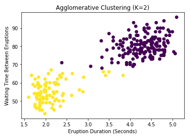
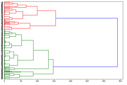
You may notice the n_clusters parameter passed to the agglom object early in the code. Didn’t I say that there was no prespecified number of clusters in hierarchical clustering? Well don’t worry, this is still true. The hyperparameter in this case is not constraining the algorithm in any way, but is just telling scikit-learn how many labels it should use to produce the output we extract. The algorithm itself still computes any number of clusters, as you can see in the dendrogram. So how exactly do we interpret this tree-like graph? Well first of all, let me say clearly that dendrograms do not tell you the optimal number of clusters. They simply provide all possible options in a hierarchical fashion. What they do tell us is how far apart our clusters are. For example, suppose I was considering using 2 clusters. Which points belong in each cluster can be found by cutting our dendrogram vertically at around 250 (see the above plot), and following the tree structure to the left until we can see which points go where. What this means is that (assuming average linkage between clusters), if we use two clusters, the average distance between them is 250. This information is very useful in determining data sparsity. One downside is that, with many clusters, it can be difficult to actually untangle the lower levels of the dendrogram.
DBSCAN
Both K-Means and Hierarchical Clustering rely mainly on the computation of distances, and consequently they produce clusters defined by perfect hyperspheres. This makes the math easier to deal with, but very few natural groupings are defined so cleanly in reality. It might make more sense to try and find a method of clustering that accounts for more arbitrary shapes. Moreover, the K-Means and Hierarchical approaches have no notion of outliers - that is, every point gets assigned to a cluster, regardless of where that point lies relative to the rest of the training set. This is a problem for unsupervised approaches used for anomaly detection, wherein we may want to find clusters while flagging points that are extreme or rare. DBSCAN is designed to assign clusters by locating regions with high densities of points, while separating outliers. Here’s how it works.
Density Based Spatial Clustering of Applications with Noise (DBSCAN) has two basic hyperparameters:
- R(Radius of Neighborhood): . This radius defines what we mean by neighborhood. If this radius includes a large enough number of points, we call that neighborhood a dense area.
- M(Minimum number of neighbors): This is the minimum number of points we need to define a cluster.
Unlike the other approaches, this one further labels points within clusters. Each point in the training set can be a core, border, or outlier point (these are mutually exclusive). These sublabels are defined in the following way:
- Core Point: Has at least M other points within its neighborhood.
- Border Point: Has fewer than M other points in its neighborhood, but is reachable from some core point (meaning the border point is within distance R of some core point).
- Outlier Point: A point that is neither a core nor a border point. These points sit in low-density areas.
What ends up happening is that a core point will form a cluster with all points reachable from it (including points reachable only from another reachable core point). Thus, these clusters end up arbitrarily shaped, and we have no way of knowing a priori how many clusters we will get. Non-core points can still be part of a cluster, but since there are no reachable points beyond them, they form the edge or perimeter of a cluster. More formally, the algorithm takes the following steps:
- Find the points in the \( R \) neighborhood of every point in the training set
- Identify those points with more than \( M \) neighbors as core points
- Find the connected components of core points on the neighbor graph, ignoring non-core points. This amounts to forming connected graphs among core points that are reachable to each other. The number of independent connected sets is our number of clusters (not specified in advance).
- Assign each point to a nearby cluster if that cluster is within \( R \) distance, otherwise it is an outlier.
Just like the other methods, this technique is surprisingly simple. And just like the others, we don’t have to worry about coding it from scratch. Scikit-learn has a transformer for this too. The following code shows how to use it:
from sklearn.cluster import DBSCAN
from sklearn.preprocessing import StandardScaler

X_scaled = StandardScaler().fit_transform(X)
dbscan = DBSCAN(eps = 0.3, min_samples = 10)
dbscan.fit(X_scaled)

labels = dbscan.labels_

#Initialize the plot with the specified dimensions.
fig = plt.figure(figsize=(6, 4))

# Colors uses a color map, which will produce an array of colors based on
# the number of labels there are. We use set(k_means_labels) to get the
# unique labels.
colors = plt.cm.Spectral(np.linspace(0, 1, len(set(labels))))
# Create a plot
ax = fig.add_subplot(1, 1, 1)
# Plots the datapoints with color col.
ax.scatter(X[:,0], X[:,1], c=labels)

# Title and axesof the plot
ax.set_title('DBSCAN (R = 0.3, M = 10)')
plt.xlabel('Eruption Duration (Seconds)')
plt.ylabel('Waiting Time Between Eruptions')

# Show the plot
plt.show()
Note that the DBSCAN transformer does not scale the data for you (unlike the KMeans and Hierarchical versions), so above I scale the data first. Keep in mind the data have been standardized when choosing the hyperparameters for DBSCAN. One other thing to note is that the algorithm in scikitlearn assigns cluster labels automatically, but assigns a label of -1 to all outlier points. These points appear as black in the plot, which is shown below.
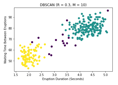
Notice that we still get 2 clusters, although I must admit that these results are largely a consequence of the hyperparameter settings, which I have not tuned properly. But this is a good sign. Notice also that unlike the first two algorithms, this technique identifies a large number of potential outliers. For Geyser data, finding such outliers is not particularly important, though recognizing such points is good practice for any data science project. However imagine if instead the data were financial transactions. You can see that considering outliers is very important for fraud detection, which is why DBSCAN is one of the most popular clustering techniques available, and has withstood the test of time since its invention in 1996.
Conclusions
I presented a lot of information about 3 main clustering techniques in this post: K-Means Clustering, Hierarchical Clustering, and DBSCAN. It can be difficult to remember all the little details, but here are some key takeaways:
- K-Means iteratively splits the data into K non-overlapping subsets with K centroids, where K is specified by the user.
- K-Means can get stuck in a local optimum, so running several iterations or random cluster breaks can give a more robust assignment
- Hierarchical Clustering gives a hierarchy of possible cluster assignments, and the user can choose which assignment to use.
- The Dendrogram is an excellent way of representing the hierarchical relationship between clusters
- DBSCAN allows for outliers by labelling each point as core, border or noise
- DBSCAN allows for an arbitrary number and shape of clusters, whereas the other two methods define clusters as perfect hyperspheres.
- All three methods are unsupervised, meaning they have no ground truth cluster labels.
There are strengths and weaknesses associated with each approach, but if you have the time during your own project, I encourage you to try all three for robustness.
Further Reading
- Here is the link to the original DBSCAN paper from AAAI 1996.
- One of the earliest papers to use K-Means clustering (at least that I could find) can be found here
- This article has a great explanation of K-Means.
- The book Information Retrieval by Manning et al. has a great chapter on hierarchical clustering.