Prerequisite Math: None
Prerequisite Coding: Python (Numpy, Scikit-learn)
Semi-supervised Learning with the Handwritten Digits Dataset
In my last post on Clustering, which you can find here, I mentioned that sometimes unsupervised learning can be used as a preprocessing step before ultimately running a supervised learning algorithm. In this short post, I’m going to walk through such an example using the famous Digits dataset, which contains 1797 grayscale images, each 8 x 8 pixels. The dataset consists of 10 different digits (0-9), each drawn around 180 times. Our goal today is to predict, based only on the picture, which digit we’re looking at. No cleaning is necessary here - scikit-learn provides the dataset freely, and it already comes with labels associated with the digit (integers 0-9 are used, since python is zero-indexed). Each pixel value ranges between 0 and 15.
Although we do have labels for each of the 1797 images here, it is almost always the case in practice that you will have at least some unlabelled data. More often than not, you will see a large amount of unlabelled data and a fairly small number of labels. We call this scenario semi-supervised learning, because it combines supervised and unsupervised techniques. This is because labelling is costly, both in terms of time and labor-hours. One of the greatest open problems in machine learning is how to train an algorithm using only a small number of training observations, such that the algorithm still generalizes to perform well on new and unseen data. Today we’ll use clustering to try and find representative images. Why would we want to do this? Well knowing that labelling is costly, it can often be helpful to use our features to try and figure out which observations will yield the highest return with regards to performance when we label them. I’ll explain in more detail later, but just know that we’ll be ‘pretending’ that not all of our data have labels.
As usual, i’ll begin by loading in the dataset and printing a few observations. I also scale the features (pixel values) to be between 0 and 1.
from sklearn.datasets import load_digits
from sklearn.model_selection import train_test_split
import matplotlib.pyplot as plt
import numpy as np

X,y = load_digits(return_X_y = True)

# Scale to be between 0 and 1
X /= 16

print(X[1])
print(y[:20])

#-----------------------------------------------

[0.     0.     0.     0.75   0.8125 0.3125 0.     0.     0.     0.
 0.     0.6875 1.     0.5625 0.     0.     0.     0.     0.1875 0.9375
 1.     0.375  0.     0.     0.     0.4375 0.9375 1.     1.     0.125
 0.     0.     0.     0.     0.0625 1.     1.     0.1875 0.     0.
 0.     0.     0.0625 1.     1.     0.375  0.     0.     0.     0.
 0.0625 1.     1.     0.375  0.     0.     0.     0.     0.     0.6875
 1.     0.625  0.     0.    ]
[0 1 2 3 4 5 6 7 8 9 0 1 2 3 4 5 6 7 8 9]
We can see that the observations are listed in order of their label, which means that we’ll have to be careful when we split into training and test (and validation) sets. The following code presents images of the first 10 images:
## Show 10 images
examples = X[:10].tolist()

# Define subplots
plt.figure(figsize = (10,10))
plt.axis('off')
# Go pic by pic
for i in range(len(examples)):
  # Reshape flattened pic
  pic_square = np.reshape(examples[i], (8,8))
  plt.subplot(2,5,i+1)
  plt.imshow(pic_square, cmap = 'gray')
  plt.axis('off')
plt.tight_layout()
plt.show()
This code results in the following plot:


Notice how grainy these images are - this is just a consequence of the small number of features (8 x 8 = 64). Now, remember how I said we were ‘pretending’ that not all of our data is labelled? Well in practice, if you’re going to label observations, the best place to start would be to create a labelled test set, so we can ultimately get some measure of performance for whatever algorithm we choose. So of the 1797 observations we have, I’ll set aside 200 of them for testing. I’ll set aside another 200 for validation, which will determine which values of the hyperparameters we use. . In both splits, I stratify by label, so we know we have a good number of observations from each class. Here is the code for both splits:
# Stratified Sampling
X_train, X_test, y_train, y_test = train_test_split(X, y, test_size = 200, stratify = y)

print('Length of X_train:', X_train.shape[0])
print('Length of X_test:', X_test.shape[0])


# Out of 200, we might expect 20 or so to be of a particular label (given 10 different labels)
X_val, X_test, y_val, y_test = train_test_split(X_test, y_test, test_size = 200, stratify = y_test)
print('Number of 1 labels in the dataset:', np.sum((y_test == 1)))

#---------------------------------------------------------------------------------------------------

Length of X_train: 200
Length of X_test: 200
Number of 1 labels in the dataset: 2
Ok great! Now we can begin to try some models. So in this case, we’ll pretend our training set is not labelled, and we want to choose some observations to label. Should we just randomly choose data points? If we believed our training set had approximately uniform coverage of our feature space, this might be ok, but in this case, with so many features, we likely suffer from the curse of dimensionality: At least some points are likely to be very far apart from others, and there are likely to be large regions of our feature space that do not contain any observations. Thus, dimensionality reduction could work well here. What we’ll do is cluster our data first, then take the observations closest to the centroids and label those. These observations are the most representative, and are likely to lead to the largest improvement in our model given that we’re only producing a small number of labels.
You might be wondering - how many labels should we make? How do we know reduce or expand our set of labelled points? Well in this case, we have a natural clustering of 10 (grouped by digit). We can just choose the image closest to the centroid of each cluster. Can we label more points? Of course! We can then label the next closest points to each of the cluster centers, and so on. Ultimately the goal is to avoid labelling the entire training set, so we’ll end up with some fraction between 0 and 1 of the training data labelled. Working outward by distance in this way is called label propagation, and it assumes that points close together in a cluster are more likely to have the same label. Note that points near the edge of a cluster are by definition closer to other clusters, so they will be more difficult to classify and can cause greater error.
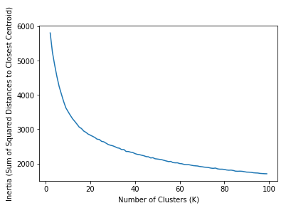
How can we be sure that 10 clusters is appropriate, if we don’t have any labels to evaluate the results? Well one way to evaluate which number of clusters is appropriate is to simply examine a wide range of \( K \), and choose the value that minimizes the inertia, which is the sum of squared distances between each point and its closest center (by default, sklearn uses euclidean distance). This is something that can be measured without training labels, and will usually indicate the appropriate number of clusters. The following code runs KMeans for a wide range of K, then reports this metric. Such a graph is called a scree plot, and what we’re looking for is an elbow, or a dip in the curve since, for \( K = N \), this metric will be zero, so the true minimum is not desirable. We can run this diagnostic across the entire training set. Note that even with a small dataset, this computation may take a while.
###### Scree Plot ########

# Values of K we want to try
K = np.arange(2,100)
# Store the mean distances
mean_dists = []

for k in K:
  k_means = KMeans(init = "k-means++", n_clusters = k, n_init = 12)
  # Fit the model
  k_means.fit(X_train)
  # Add the inertia to our list
  mean_dists.append(k_means.inertia_)

## Plot our results
mean_dists = np.array(mean_dists)
# Create Plot
plt.plot(K, mean_dists)
plt.xlabel('Number of Clusters (K)')
plt.ylabel('Inertia (Sum of Squared Distances to Closest Centroid)')
plt.show()
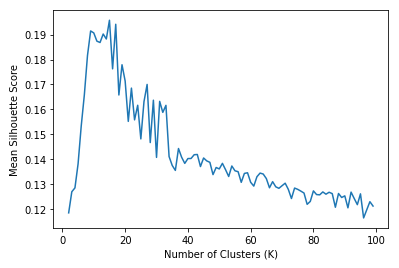
Another choice of metric we have is called the silhouette score, which is defined in the following way: \(S = \frac{b - a}{max(a, b)}\) Where \( a \) is the mean distance to other instances in the same cluster, and \( b \) is the mean nearest-cluster distance. Note that this coefficient ranges between -1 and 1, where 0 means the data point is near a cluster boundary, and -1 indicatest that a datapoint is likely assigned to the wrong cluster. This silhouette coefficient is computed for each point in our training set, and we take the mean score for a given value of \( K \). The following code produces the plot associated with this measure:
##### Silhouette Score #####
from sklearn.metrics import silhouette_score

# Values of K we want to try
K = np.arange(2,100)
# Store the silhouette score
sils = []
for k in K:
  k_means = KMeans(init = "k-means++", n_clusters = k, n_init = 12)
  # Fit model
  k_means.fit(X_train)
  # Extract labels
  labels = k_means.labels_
  # Extract silhouette score
  s = silhouette_score(X_train, labels)
  # Add the mean of the root of the distances to our list
  sils.append(s)

## Plot our results
mean_sils = np.array(sils)
# Create Plot
plt.plot(K, mean_sils)
plt.xlabel('Number of Clusters (K)')
plt.ylabel('Mean Silhouette Score')
plt.show()
The two snippets of code produce the following plots. I run each for a very wide range of K.


The plot on the left shows the intertia, which we want to minimize (or rather find an elbow), and the right plot shows silhouette scores, which we want to maximize. The intertia plot is not so helpful - there is no obvious elbow, and the curve is quite smooth. However, the silhouette scores indicate that there should be more than 10 clusters. It seems the number should be closer to 20. Though I do not show it here, the silhouette score declines after \( K = 100 \), and with the exception of the extreme swings near lower numbers (0-10ish), the curve forms a fairly smooth downward-facing parabola. So we interpret that the appropriate number of clusters is around 100. This is surprising, given that we know there are natural groupings that form much fewer than 20 separate categories.
Let’s try running the KMeans algorithm to generate labels for these 20 clusters, then feeding the results to a simple logistic regression model. I say simple, but with multiple classes, Scikit-learn will treat this as a multinomial logistic regression. Just to repeat what I mentioned above, here’s what the following code does:
- Run KMeans with \( K = 20 \) to produce \( K \) centroids
- Take the points closest to each cluster centroid as our set of 20 representative images
- Train the Logistic Classifier using these 100 labelled training points
- Evaluate the trained model on our validation set
from sklearn.linear_model import LogisticRegression

k = 20
kmeans = KMeans(n_clusters = k)
# Convert training pixels into point-centroid distances
X_digits_dist = kmeans.fit_transform(X = X_train)
# Choose the image that is closest to each cluster's centroid (40 total)
representative_digit_idx = np.argmin(X_digits_dist, axis = 0)
# Choose instance based on index
X_representative_digits = X_train[representative_digit_idx]
y_representative_digits = y_train[representative_digit_idx]

log_reg = LogisticRegression()
log_reg.fit(X_representative_digits, y_representative_digits)
log_reg.score(X_val, y_val)
This produces a validation accuracy of 82%, which is pretty great. For comparison, running the same code using \( K = 10 \) should (subject to a bit of randomization error) give an accuracy of around 69%. Just to put this in context, given our 10 classes, simple random guessing would result in an average accuracy of 180/1800 or 10%. So we’ve achieve quite an improvement. However, we’ve only used half of our training observations. Obviously the lesson here is that labelling more data (though always a good option) is costly, so can we propagate our 100 labelled training points to the other half in a meaningful way? We sure can.
Let’s assume to start, we want to propagate to all the remaining labels. In other words, we have 20 representative images, and each unlabelled point will be assigned the label of the representative image within its cluster. This is full label propagation, and the following code runs this, then fits the resulting training set (now with 1597 labelled points) to the same logistic regression model as before.
y_train_propagated = np.empty(len(X_train), dtype = np.int32)
for i in range(k):
  y_train_propagated[kmeans.labels_==i] = y_representative_digits[i]

log_reg = LogisticRegression(max_iter=2000)
log_reg.fit(X_train, y_train_propagated)
log_reg.score(X_val, y_val)
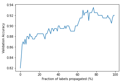
This results in a validation accuracy of 92%. Even better!. But is it possible to do better with fewer training instances? That notion might surprise you. Shouldn’t adding training observations always improve performance? Well, not necessarily, especially if the labels are not guaranteed to be correct. When we fully propagate our labels by cluster, we include data points that are near cluster boundaries, which are much more likely to be mislabelled. An obvious next question is: is there some fraction of the remaining observations that we can use which will improve performance even more? If so, what is that fraction? This is usually true in general, but the specific fraction will vary depending on the dataset. The following code is designed to extract the appropriate fraction of propagated points, then train our logistic regression model on that training set. So for say 20% propagation, we choose the 20% of points closest to their cluster centers (not including the representative points). How accurate can we make the model?
k = 20
fracs = np.arange(0,100)
accs = []

for p in fracs:
  # How far do we get from the centroids?
  percentile_closest = p
  # We only care about the distance to the closest cluster (not all of them)
  X_cluster_dist = X_digits_dist[np.arange(len(X_train)), kmeans.labels_]
  # Loop through each label
  for i in range(k):
    # Capture points in cluster i
    in_cluster = (kmeans.labels_ == i)
    # print('Size of Cluster:', np.sum(in_cluster))
    # Take distances of those points
    cluster_dist = X_cluster_dist[in_cluster]
    # What distance corresponds to p percentage of points in this cluster?
    cutoff_distance = np.percentile(cluster_dist, percentile_closest)
    # Which points will not be labelled?
    above_cutoff = (X_cluster_dist > cutoff_distance)
    # Give those points a label of -1
    X_cluster_dist[in_cluster & above_cutoff] = -1
  # Take only the labelled point indices
  partially_propagated = (X_cluster_dist != -1)
  # Capture the training subset based on those images
  X_train_partially_propagated = X_train[partially_propagated]
  y_train_partially_propagated = y_train_propagated[partially_propagated]

  # Train the model on partial propagation
  log_reg = LogisticRegression(max_iter = 5000)
  log_reg.fit(X_train_partially_propagated, y_train_partially_propagated)
  # Add val accuracy to list
  accs.append(log_reg.score(X_val, y_val))
The code above approaches the problem from the opposite way, assigning training observations a label of -1 if that point does not get used in training. The amalgamation of these points for all label values (clusters) gives us a way of filtering the entire training set to separate out just the propagations I want. Finally the following code produces a plot of validation accuracy for each fraction of propagation from 1 to 100 (full propagation gives accuracy of 0.92 if you recall).
# Now plot the accuracy based on propagation
perf = np.array(accs)
plt.plot(fracs, perf)
plt.xlabel('Fraction of labels propagated (%)')
plt.ylabel('Validation Accuracy')
plt.show()

We can see that it is possible to achieve better performance using less than full label propagation. It looks like around 80% propagation works best, achieving a validation error of around 93.5%. Is this near optimal? To get an idea of how this compares to actually labelling the data, I’ll train the same logistic regression model on the training and validation sets, using the correct labels. Let’s see how the test error compares to our errors using representative samples:
X_train, X_test, y_train, y_test = train_test_split(X, y, test_size = 0.25, stratify = y)

log_reg = LogisticRegression(max_iter = 500)
log_reg.fit(X_train, y_train)
log_reg.score(X_test, y_test)
This gives a test accuracy of 96%. I want to re-emphasize what we’ve done. If we could have labelled all the images by hand, we would have achieved a test accuracy of (roughly) 96%. But by only labelling a representative set of just 20 images, we were able to obtain an accuracy of 82%. Moreover, referring to our graph, we can see that 90% accuracy can be achieved by only labelling 40% of the data. This is a performance that is approximately 94% as good as our fully labelled algorithm, but requiring only 2/5 the work (and in a industry setting, 40% the cost). This is one of the most overlooked benefits of unsupervised learning - it can reveal structures that dramatically simplify supervised learning tasks.
Conclusion
Let me be clear - we did not reduce the dimension of our feature here. All we did was use clustering assignments to inform our choice of training observations to label. This approach increases efficiency and leads to performance that is nearly as good having a fully-labelled training set. Note that for different datasets, you may not be able to achieve results this good, since there may not be a set of observations that well-represent the rest. In that case, you may have to bite the bullet and label a large number of observations by hand. Regardles, you should always start by labelling a test set to give you an estimate of generalizability. But this and other methods may help you overcome sparsity in labels during training.
Further Reading
- I recommend Hands on Machine Learning by Aurelien Geron. It is an excellent book covering many of today’s relevant ML algorithms, and this example is based on an exercise from one of its chapters.
- The Scikit-learn documentation is an excellent source of examples. The developer team maintains most state-of-the-art algorithms.
- Coursera has a number of excellent ML courses that cover clustering and supervised methods.